_ Case Study (00)

Research, direction and UX refinement to create an experience that educated users and met OKRs.

Research, direction and UX refinement to create an experience that educated users and met OKRs.

Cirkul

Scope Navigation Redesign / Client Cirkul / Duration 8wks / Year 2025

( scroll )
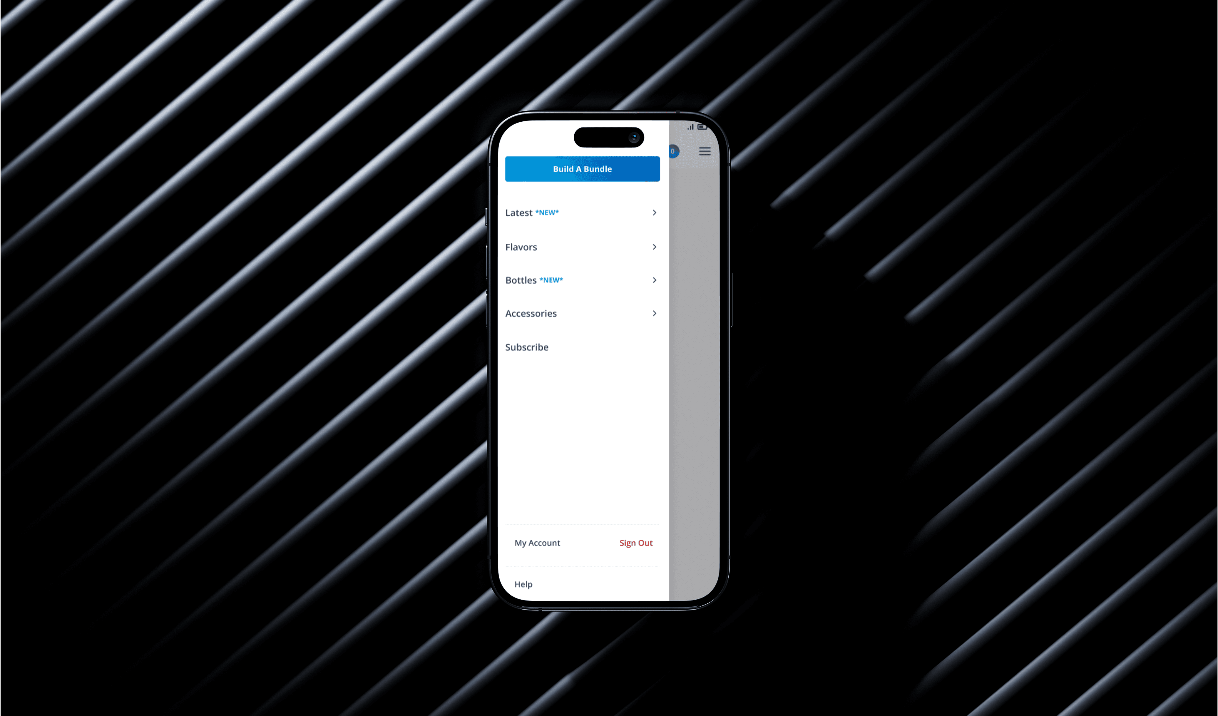
Cirkul mobile navigation on a dark backdrop

_ The Short Version

(01)

Cirkul’s navigation was working…but not working well enough.

Cirkul’s navigation was working…but not working well enough.

Cirkul’s navigation was working…but not working well enough.

High-intent users could complete tasks, but friction and unclear paths slowed discovery. Here’s what changed — and what it moved.

+33%

Task Completion Rate

-42s

Time on Task

+11%

First-Click Success

_ The Rules

(02)

We optimized for decision-making, not decoration.

We optimized for decision-making, not decoration.

We optimized for decision-making, not decoration.

( 01 )

Don’t make me think

Don’t make me think

Don’t make me think

Simple verbiage for easy tasks. If a label needs explaining, it isn’t the label.

( 02 )

Make shopping easy

Make shopping easy

Make shopping easy

Shopping should feel fluid and enticing — not funneled through a single page.

( 03 )

Moments of delight

Moments of delight

Moments of delight

Captivating visuals that peak curiosity and reward exploration.

_ The Work

(03)

Every change was tied to a behavioral signal.

Every change was tied to a behavioral signal.

Every change was tied to a behavioral signal.

No redesign theater. Every move traced back to something users actually did.

Complete navigation flow map across every shopping path

Every shopping path, mapped before a single pixel moved.

Relocate the CTA to the nav bar

Relocate the CTA to the nav bar

Cleaner inside the menu — but conversion lives in sight. We moved it where intent happens.
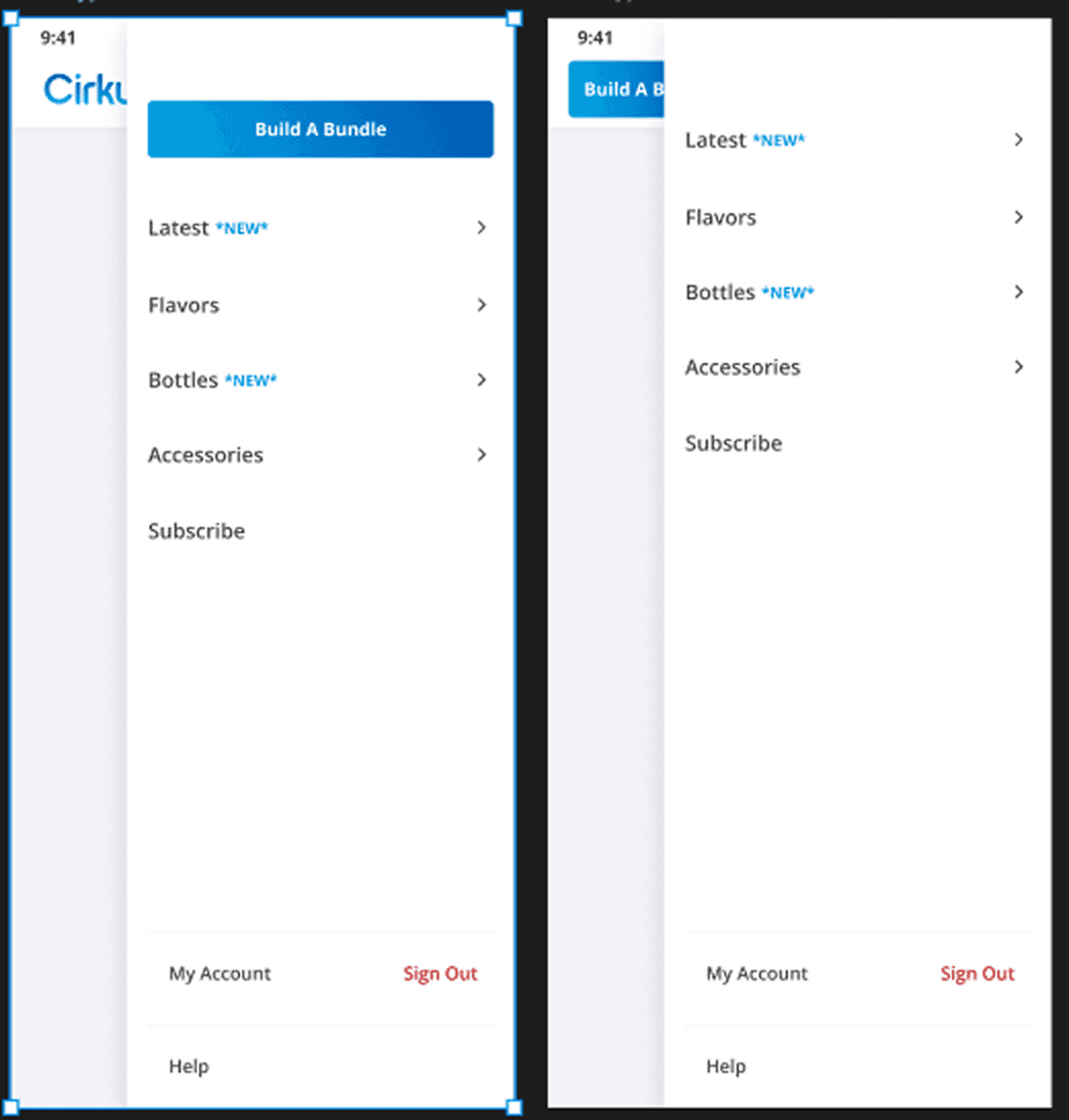
Mobile navigation with the CTA relocated to the nav bar

More clarity to actions

More clarity to actions

A labeled back button and lighter visuals made the catalogue faster to scan and easier to leave.
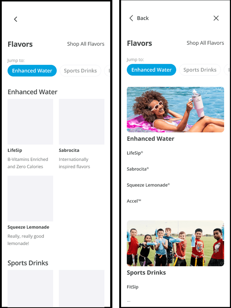
Catalogue screens with clearer action labels

_ The Payoff

(04)

This wasn’t just a navigation update it created a foundation.

This wasn’t just a navigation update it created a foundation.

This wasn’t just a navigation update it created a foundation.

Clearer decision paths unlock future optimization, experimentation, and merchandising flexibility.

Animated prototype of the shipped navigation

The shipped navigation, in motion.

_ The Invitation (05)

Want the full story?

This is the short version. The research, the trade-offs, and the numbers behind it are a conversation away.

UXbyAndrew

Whether you're building a brand, designing a product, or simply want to explore an idea, I'd love to hear from you.

uxbyandrew@yahoo.com

UXbyAndrew

Whether you're building a brand, designing a product, or simply want to explore an idea, I'd love to hear from you.

uxbyandrew@yahoo.com

UXbyAndrew

Whether you're building a brand, designing a product, or simply want to explore an idea, I'd love to hear from you.

uxbyandrew@yahoo.com