Cirkul

Cirkul

I provided research, direction and UX refinement to create an experience that educated and met OKRs

I provided research, direction and UX refinement to create an experience that educated and met OKRs

Scope Navigation Redesign

/

Client Cirkul

/

Duration 8wks

/

Year 2025

Scope

Website Redesign

Client

Cirkul

Duration

12wks

Year

2024

_ Overview

(00)

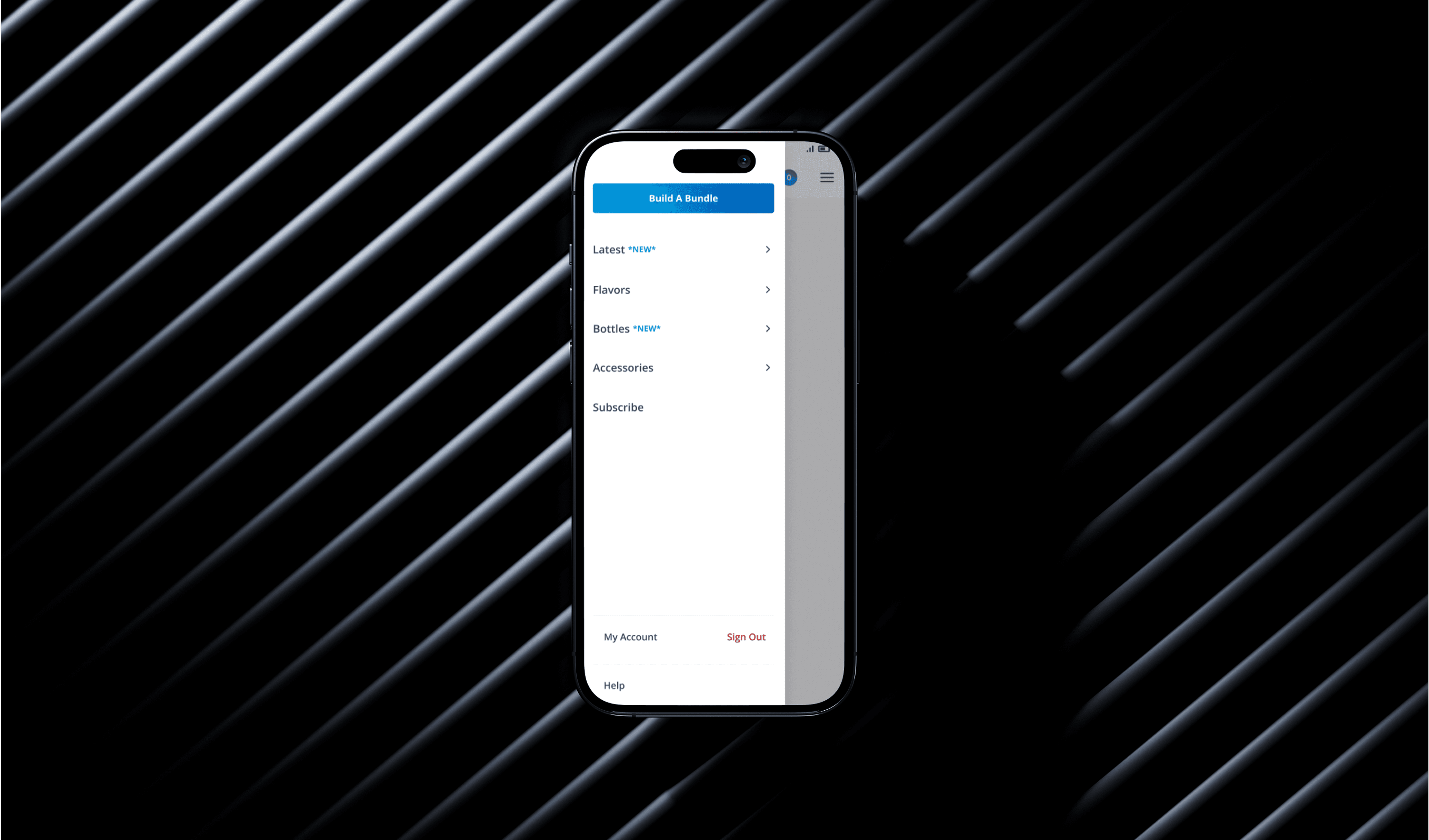
Cirkul’s navigation was working…but not working well enough.

High-intent users could complete tasks, but friction, hesitation, and unclear paths slowed discovery and reduced confidence.

High-intent users could complete tasks, but friction, hesitation, and unclear paths slowed discovery and reduced confidence.

Results

+

33

%

Task Completion Rate

42

seconds

Decreased Time on Task

+

11

%

First Click Success

_ Design Principles

(01)

The rules by which we would design and decide.

The rules by which we would design and decide.

Aligning on our design principles allowed ups to zoom out and keep our designs and decision making accountable.

Aligning on our design principles allowed ups to zoom out and keep our designs and decision making accountable.

_ Don't make me think

_ Don't make me think

Simple verbiage for easy tasks

Simple verbiage for easy tasks

_Make shopping easy

_Make shopping easy

Shopping should feel fluid and enticing

Shopping should feel fluid and enticing

_ Moments of delight

_ Moments of delight

Use captivating visuals and peak curiosity

Use captivating visuals and peak curiosity

_ Challenge

(02)

Clarity issues were hiding inside “acceptable” performance.

Clarity issues were hiding inside “acceptable” performance.

Baseline testing revealed that users eventually succeeded, although often through trial, hesitation, or incorrect first clicks.

Baseline testing revealed that users eventually succeeded, although often through trial, hesitation, or incorrect first clicks.

Our updated design drastically reduced failures and eliminated abandons

_ Design Strategy

(02)

We optimized for decision-making, not decoration.

We optimized for decision-making, not decoration.

Every design change was tied to a specific behavioral signal we wanted to improve.

Every design change was tied to a specific behavioral signal we wanted to improve.

_ Task Success Challenges

(02.1)

High error rates & rage quits
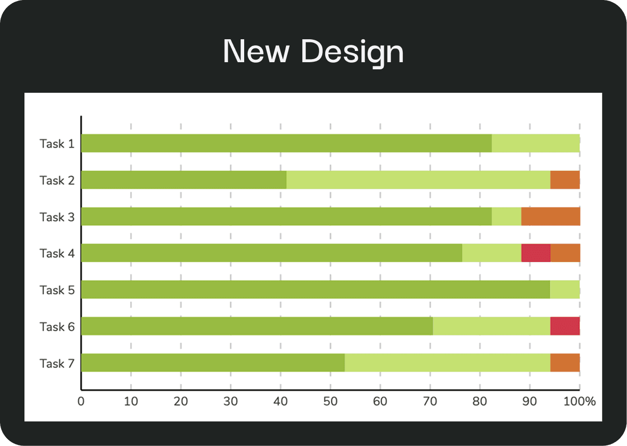
Users completed tasks, but often took indirect paths or clicked the wrong entry point first, or proved too frustrating to finish.

Users completed tasks, but often took indirect paths or clicked the wrong entry point first, or proved too frustrating to finish.

_ Task Success Rates

(02.2)

Success signaled by improved task completion

New designs eliminated abandons (Grey) and greatly reduced failure

New designs eliminated abandons (Grey) and greatly reduced failure

_ Fluid shopping experience

(02.3)

Users aren't shopping because they've been funneled.

90% of sales are made up of 6% of the product catalogue because users are funneled to a single shopping page. The new navigation increases product visibility and encourages exploration.

90% of sales are made up of 6% of the product catalogue because users are funneled to a single shopping page. The new navigation increases product visibility and encourages exploration.

_ Key Changes & Feedback

(03)

Clarity translated directly into measurable improvement.

Clarity translated directly into measurable improvement.

The updated navigation improved performance across every primary usability metric.

The updated navigation improved performance across every primary usability metric.

_ Key Changes & Feedback

Relocate CTA to the Nav bar

While keeping the blue CTA button inside the mobile nav produced a cleaner and more balanced aesthetic, we wanted to balance conversion and guard against potential losses due to visibility.

While keeping the blue CTA button inside the mobile nav produced a cleaner and more balanced aesthetic, we wanted to balance conversion and guard against potential losses due to visibility.

_ Key Changes & Feedback

More clarity to actions

We decided to drive more clarity by including a action label to the back button, as well as, reducing the visuals to allow for a shorter scroll through the extensive catalogue.

We decided to drive more clarity by including a action label to the back button, as well as, reducing the visuals to allow for a shorter scroll through the extensive catalogue.

_ Validation & Outcomes

(03)

Clarity translated directly into measurable improvement.

Clarity translated directly into measurable improvement.

The updated navigation improved performance across every primary usability metric.

_ Results

(04)

This wasn’t just a navigation update, it created a foundation.

Clearer decision paths unlock future optimization, experimentation, and merchandising flexibility.

Clearer decision paths unlock future optimization, experimentation, and merchandising flexibility.

Results

+

33

33

%

Task Completion Rate

Task Completion Rate

42

42

seconds

Decreased Time on Task

Decreased Time on Task

+

11

11

%

First Click Success

First Click Success

Have a project idea?

Have a project idea?

We'll schedule a call to discuss your idea. After discovery sessions, we'll send a proposal, and upon approval, we'll get started.

We'll schedule a call to discuss your idea. After discovery sessions, we'll send a proposal, and upon approval, we'll get started.

UXbyAndrew

Whether you're building a brand, designing a product, or simply want to explore an idea, I'd love to hear from you.

uxbyandrew@yahoo.com

UXbyAndrew

Whether you're building a brand, designing a product, or simply want to explore an idea, I'd love to hear from you.

uxbyandrew@yahoo.com

UXbyAndrew

Whether you're building a brand, designing a product, or simply want to explore an idea, I'd love to hear from you.

uxbyandrew@yahoo.com