
_ Overview
(00)
A design system in name, but not in practice.
PODS had a disconnected Figma file: loose artifacts, competing foundations, unclear ownership, and little guidance for how teams should use or maintain it.
Designers were solving the same problems differently. Engineers were filling the gaps. Handoffs took too long. Consistency depended too much on who touched the file last.
Results
Improved design/dev communication
3 languages -> One system
Tokens & values for org-wide use
_ The shift
(01)
The work started with ownership.
Before touching components I brought together tech leads, PMs, engineers, and designers to define how the system would actually operate.
SYSTEM DIRECTION OWNER
Discovery design
Defines standards, reviews quality, and keeps the system coherent.
shared contribution model
ENGINEERING
BOOKING
POST-BOOKING
_ Foundations
(02)
The first release focused on the decisions every product surface depended on: typography, color, grid, spacing, radius, shadows, blurs, and iconography.

Insight: each of the 4 design teams inherited different typography sets & differing usage rulesets which was a major source of frustration (and inconsistency).
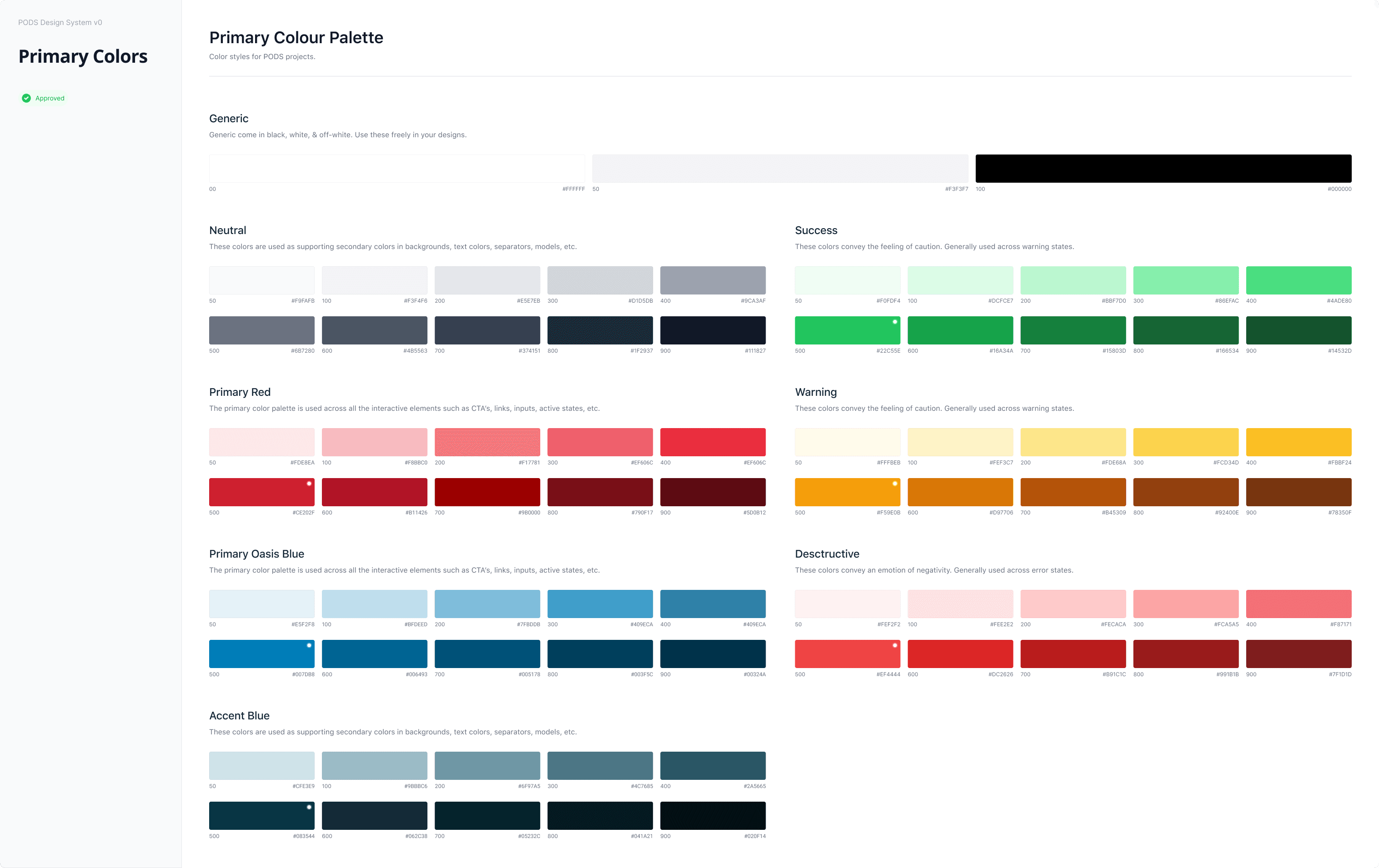
Insight: the color pallete was simplified down from 800+ colors streamlining tokenization and usage & designers struggled with congruency.

Insight: A large QoL upgrade for designers was now having clarity when driving hierarchy with colors & a single shared system of definitions.
_ Components
(03)
Once the foundations were stable, I moved into the patterns teams used most often and misused most frequently: buttons, inputs, dropdowns, accordions, alerts, calendars, and controls
STATES
Every variant had a clear behavior.
Default, hover, focus, disabled, loading, validation, and edge cases were documented in context.
RULES
Usage guidance replaced tribal knowledge.
Do and don't examples made review conversations faster and reduced personal interpertation.
HANDOFF
Engineers could see what happened next.
Interaction and edge cases were visible before implementation conversation began.

Every state, defined: hover, focus, pressed, disabled, and loading across every style and size, one source of truth for all three teams. Red for top of funnel, Blue for mid-funnel & decision making.

Documentation layer: usage guidance, anatomy, and visual do’s and don’ts ship with every component; the library doubles as onboarding.
_ Risk
(04)
The hardest conversation was implementation. PMs were concerned that changing naming conventions and retroactively updating components would pull engineering time away from roadmap work.
So we made the rollout practical. Typography and colors would be updated retroactively because engineering saw low risk. Components would be adopted moving forward, unless a surface was already in scope for redesign or cleanup.
_ Outcome
(05)
Designers could grab assets and trust they were using the right thing. Engineers had clearer guidance. PMs had a rollout plan that respected delivery constraints. The product experience became more consistent across teams.
Aligned teams
One language across three product areas.
Clear ownership
A contribution model with accountability.
Repeatable quality
Standards replaced one-off interpertation.
VP of Digital Design
_ Highlights
(06)
01
Led design system direction and governance across Discovery, Booking, and Post-Booking.
02
Consolidated competing foundations into a shared system for type, color, spacing, radius, shadows, blurs, and iconography.
03
Prioritized high-use components and documented states, edge cases, usage rules, and interaction behavior.
04
Partnered with PMs and engineers to create a rollout model that improved consistency without unnecessary engineering churn.
05
Reduced hour-plus handoff walkthroughs into focused 15-20min implementation discussions.