case study — cirkul (2024)
The brief asked for an acquisition-first homepage. The traffic data said 80% of visitors were returning customers. Rebalancing the page around both audiences cut funnel drop-off by 28% — without disrupting a live, revenue-generating storefront.
Funnel drop-off
52.17% → 37.42% homepage-to-PLP
Revenue per visitor
$5.94 → $6.09
First-time buyer conversion
4.65% → 4.78%
measured via a two-week 50/50 A/B test across ~150k sessions (Optimizely), on a storefront serving 37M sessions and $90M in revenue
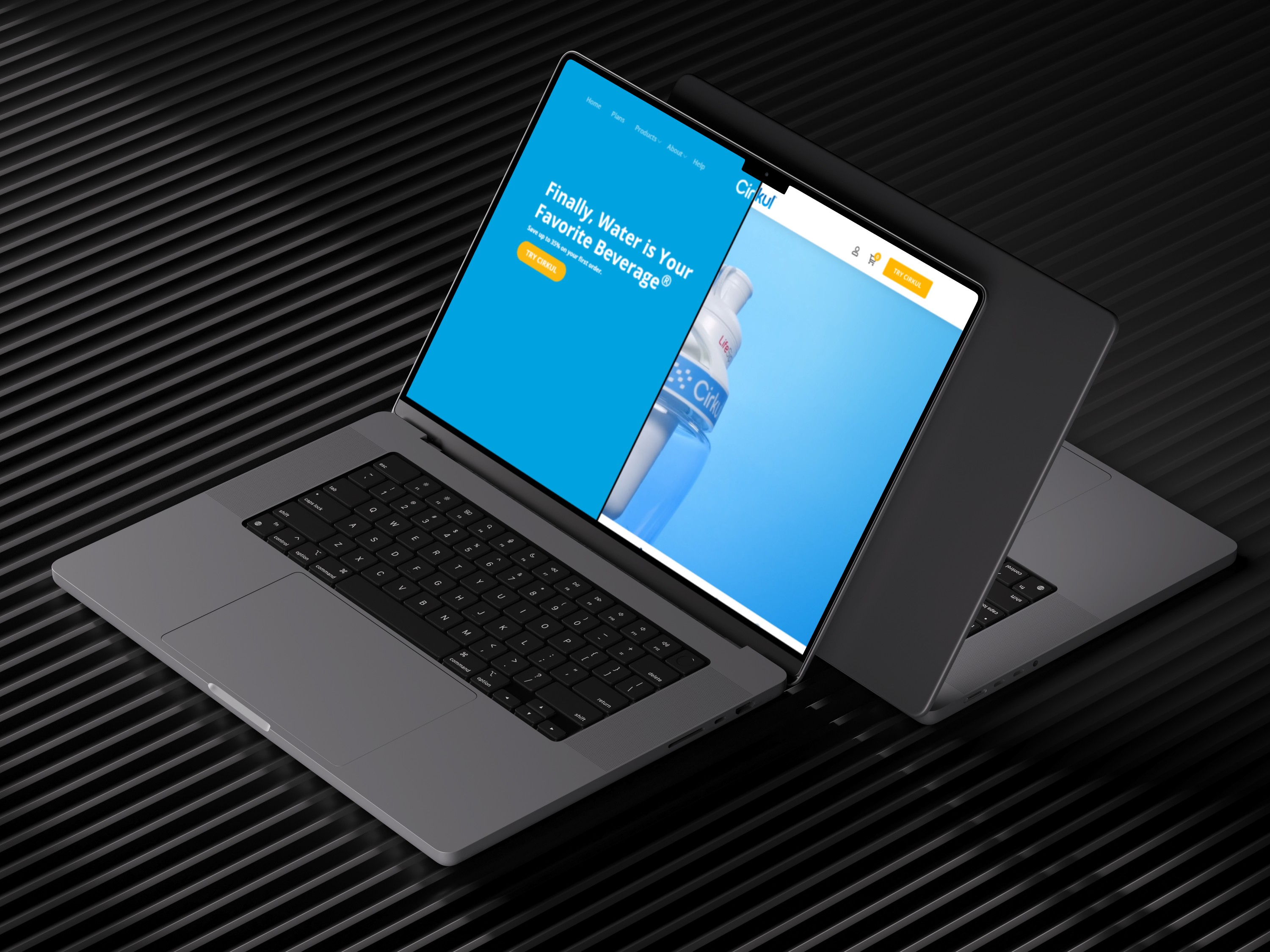
_ overview
(00)
A customizable hydration brand with a homepage that wasn’t working for either of its audiences.
Cirkul sells a personalized drinking experience — a bottle and flavor-cartridge system with adjustable intensity. That novelty is the brand’s biggest asset and its biggest UX problem: first-time visitors need education before they’ll buy, while a large returning audience just wants a fast path to product.
As Lead UX Designer, I owned content strategy, information hierarchy, and page layout for the homepage. I defined MVP requirements from stakeholder workshops and behavioral data, partnered with PM on sequencing releases by risk, and worked with brand and creative to keep the educational layer on-voice. Because the site processes significant daily revenue, every decision had to move conversion metrics without destabilizing a live storefront.
Results
37
million
Sessions
90
million
Revenue Generated
2
million
Products Sold
_ the challenge
(01)
Half of all visitors never made it past the homepage.
The existing homepage tried to be a brand story and a storefront at once, and did neither deliberately. New visitors left with more questions than answers about how the product worked; returning customers had to fight past education they didn’t need to reach the products they came for.
52%
drop-off rate
of visitors abandoned the funnel between the homepage and the product listing page — before product discovery could even begin.
80%
traffic composition
of homepage traffic was returning customers arriving with high purchase intent — and no prioritized pathway to product.

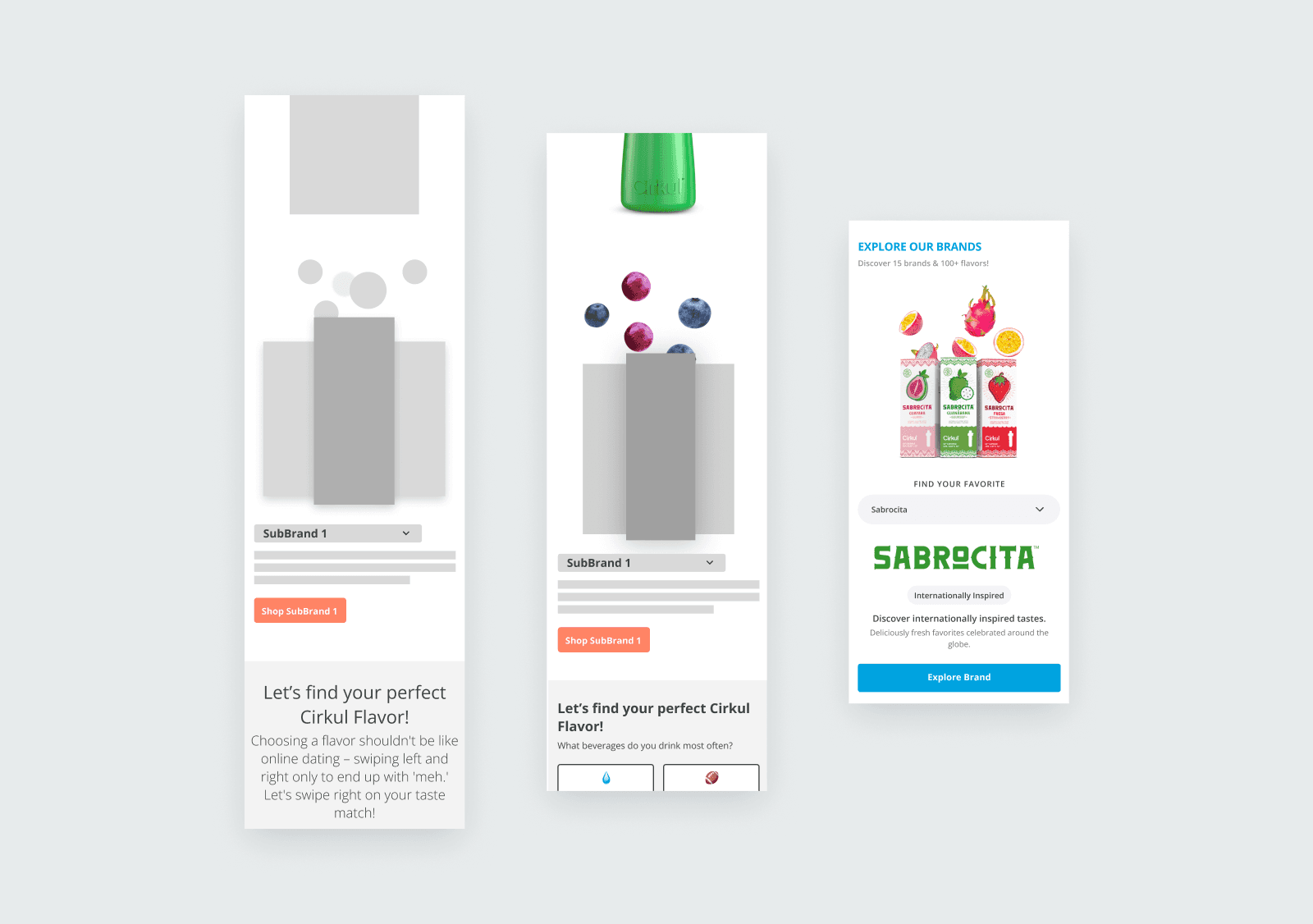
Before: education and commerce competing for the same real estate, with no clear hierarchy for either audience.
_ the turn
(02)
The initial brief was acquisition-first: a value-proposition-forward page structured around brand education from top to bottom. Before designing to it, I pulled the traffic data — and it told a different story. Roughly 80% of visitors were returning customers with high intent. A page optimized purely for new-user education would add friction for the vast majority of people actually landing on it.
I brought that back to stakeholders and reframed the conversation: not a departure from the acquisition goal, but a balance between new-user education and returning-user efficiency. The data made the case for me.
The tradeoff was explicit: a page no longer built primarily around new-user education, in exchange for significantly less friction for ready-to-buy shoppers. Not a tested hypothesis at that point — a data-informed structural call, aligned with stakeholders before a single frame was designed.
visual to create: traffic-split diagram (80% returning / 20% new) → hybrid page structure
Insight: the audience split reframed the whole page architecture before design began.
_ the solution
(03)
The right information at the right moments — without disrupting the shopping flow.
Every section on the page earned its position. The structure follows the visitor’s decision journey: orient, shop, understand, commit. I collaborated with the creative team on educational visuals that ease cognitive load and delight with subtle interaction — but each module below exists for a structural reason, not a stylistic one.

Hero: value proposition above the fold gives first-time visitors immediate context; product imagery grounds the story in the physical system. One frame, both audiences.
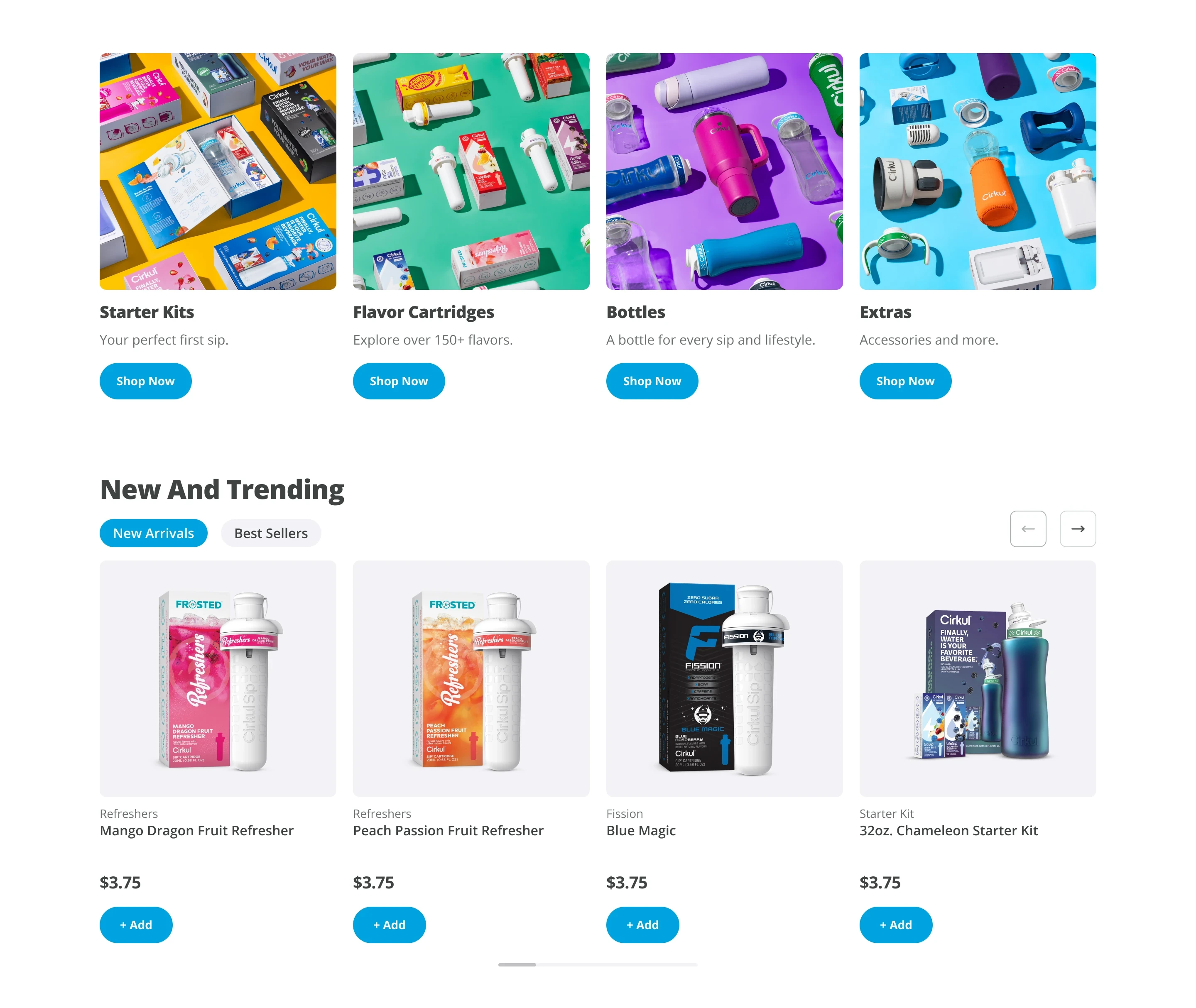
Shop lanes, directly below the hero: a structural call driven by the 80% returning traffic. Broad-to-specific hierarchy, category lanes to orient, then carousels ranked by real sales data, so returning users reach product in one scroll.

Education layer: benefit-led modules built for under-five-second comprehension, then step-by-step visuals of how the system works. Trust for new visitors, positioned where it can’t slow down shoppers.
_ how we knew
(04)
We ran the redesign as a two-week A/B test in Optimizely with a 50/50 split across roughly 150k sessions, layered with Hotjar scroll and behavioral analysis, and kept performance monitoring running post-launch. Conversion metrics told us whether the structure worked; the behavioral layer told us why.
_ how we knew
(04)
We ran the redesign as a two-week A/B test in Optimizely with a 50/50 split across roughly 150k sessions, layered with Hotjar scroll and behavioral analysis, and kept performance monitoring running post-launch. Conversion metrics told us whether the structure worked; the behavioral layer told us why.
Optimizely · 50/50 split
~150k sessions
2-week test window
Hotjar scroll + behavior
post-launch monitoring
−28%
relative
Funnel drop-off
Homepage-to-PLP abandonment fell sharply, moving more users into product discovery — the primary goal of the restructure.
52.17% → 37.42% (−14.75 pts absolute)
+29%
relative
Scroll depth
Hotjar heatmaps showed more users reaching key mid-page content — the education layer was being found, not skipped.
45% → 58% reach at the 50% scroll threshold
+2.8%
relative
First-time buyer conversion
The above-the-fold value proposition and immediate shop lanes reduced early friction for new visitors.
4.65% → 4.78%
+2.5%
relative
Revenue per visitor
Momentum for the returning 80% was preserved and slightly improved — the hybrid didn’t trade one audience for the other.
$5.94 → $6.09
_ Looking back
(06)
What this project sharpened.
01
Interrogate the brief before designing to it.
One traffic pull reshaped the entire page architecture. The most valuable design work happened before any frames existed.
02
Live-revenue redesign is a risk problem.
Sequencing releases by impact and risk — homepage first, validated, then extended — built stakeholder confidence release by release.
03
Honest metrics build more trust than big ones.
Attributed deltas with baselines and method beat impressive absolute numbers. Stakeholders — and hiring managers — can tell the difference.
Have a project idea?
We'll schedule a call to discuss your idea. After discovery sessions, we'll send a proposal, and upon approval, we'll get started.