
_ Overview
(00)
A customizable hydration brand with a homepage that wasn’t working for either of its audiences.
As Lead UX Designer, I owned content strategy, information hierarchy, and page layout for the homepage. Defined MVP requirements from stakeholder workshops and behavioral data, and worked with brand and creative to keep the educational layer on-voice.
Measured via a two-week 50/50 A/B test across ~150k sessions (Optimizely), on a storefront serving 37M sessions and $90M in revenue
Results
-28
Percent
Funnel Drop Off
+2.5
Percent
Revenue per Visitor
+2.8
Percent
First-Time buyer Conversion
_ Challenge
(01)
The existing homepage tried to be a brand story and a storefront at once, and did neither deliberately. New visitors left with more questions & returning customers had to fight to reach the products they came for.
drop-off rate
52%
of visitors abandoned the funnel between the homepage and the product listing page.
traffic composition
80%
of homepage traffic was returning customers arriving with high purchase intent.
_ Brief
(02)
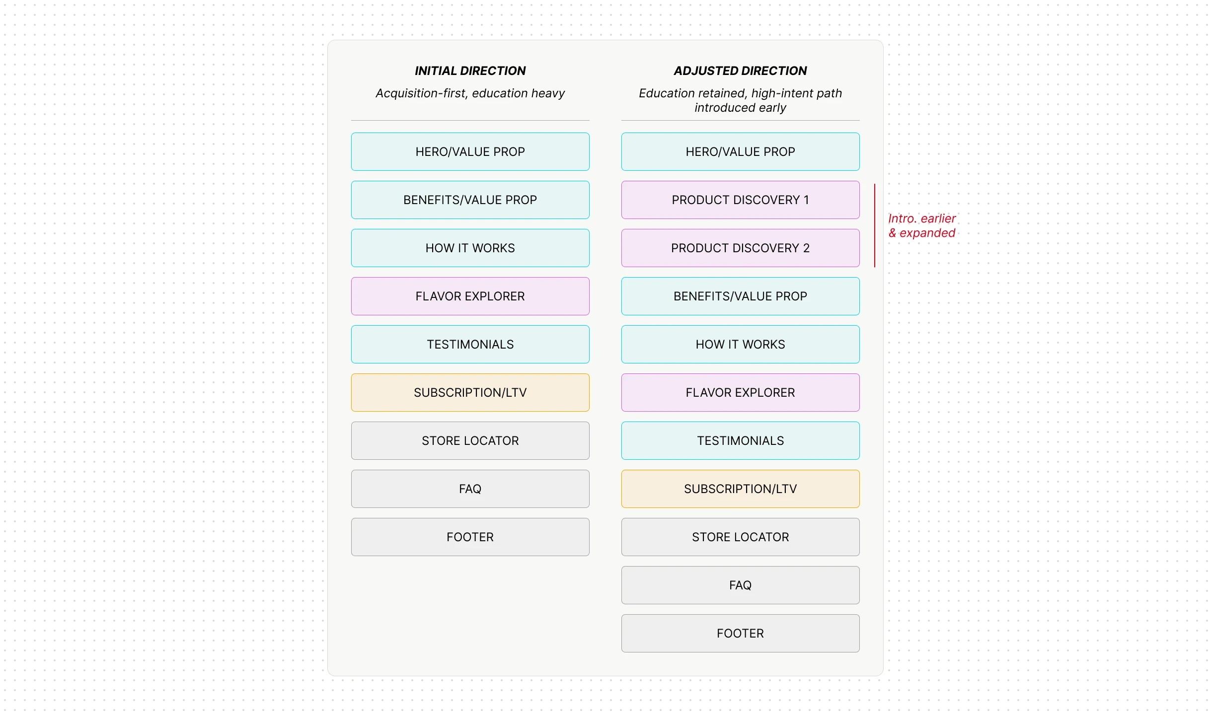
The brief was acquisition-first: top-to-bottom brand education.
But the data said otherwise, about 80% of visitors were returning customers, so an education-heavy page meant friction for most of our audience.
I aligned stakeholders, reframing the challenge as a balance between new-user education and returning-user efficiency.
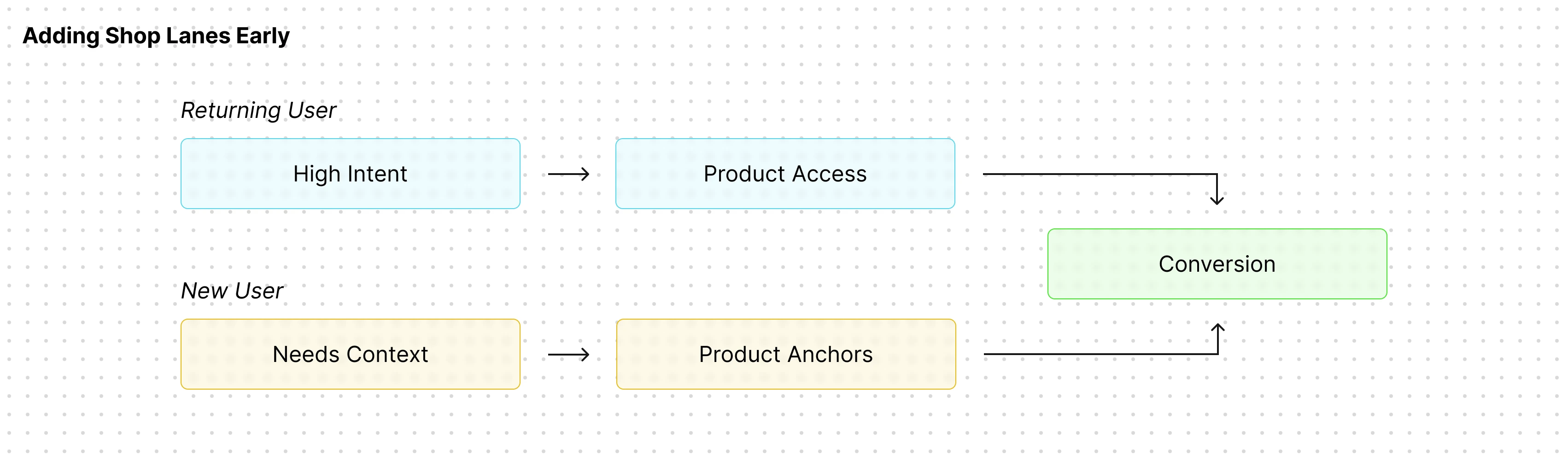
Insight: the audience split reframed the whole page architecture before design began.
_ the solution
(03)
Every section on the page earned its position. The structure follows the visitor’s decision journey: orient, shop, understand, commit.
I collaborated with the creative team on educational visuals that ease cognitive load and delight with subtle interaction.

Hero: value proposition above the fold gives first-time visitors immediate context; product imagery grounds the story in the physical system. One frame, both audiences.
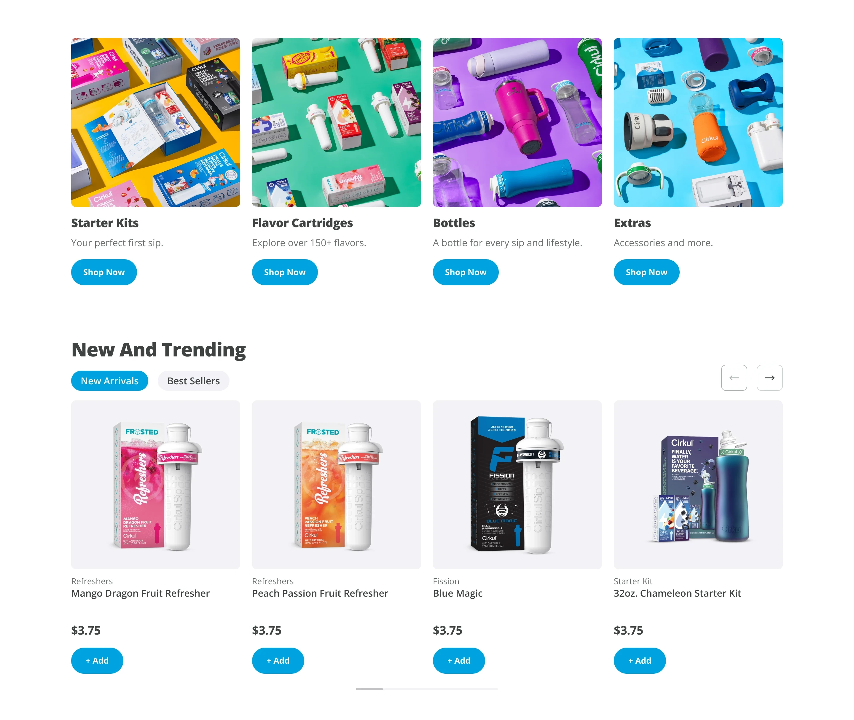
Shop lanes, directly below the hero: a structural call driven by the 80% returning traffic. Broad-to-specific hierarchy, category lanes to orient, then carousels ranked by real sales data, so returning users reach product in one scroll.

Education layer: benefit-led modules built for under-five-second comprehension, then step-by-step visuals of how the system works. Trust for new visitors, positioned where it can’t slow down shoppers.
_ how we knew
(04)
We ran the redesign as a two-week A/B test in Optimizely with a 50/50 split across roughly 150k sessions, layered with Hotjar scroll and behavioral analysis, and kept performance monitoring running post-launch. Conversion metrics told us whether the structure worked; the behavioral layer told us why.
Optimizely · 50/50 split
~150k sessions
2-week test window
Hotjar scroll + behavior
post-launch monitoring
−28%
relative
Funnel drop-off
Homepage-to-PLP abandonment fell sharply, moving more users into product discovery — the primary goal of the restructure.
52.17% → 37.42% (−14.75 pts absolute)
+29%
relative
Scroll depth
Hotjar heatmaps showed more users reaching key mid-page content — the education layer was being found, not skipped.
45% → 58% reach at the 50% scroll threshold
+2.8%
relative
First-time buyer conversion
The above-the-fold value proposition and immediate shop lanes reduced early friction for new visitors.
4.65% → 4.78%
+2.5%
relative
Revenue per visitor
Momentum for the returning 80% was preserved and slightly improved — the hybrid didn’t trade one audience for the other.
$5.94 → $6.09
_ Looking back
(05)
01
Interrogate the brief before designing to it.
Data redefined the entire page architecture. The most valuable design work happened before any frames existed.
02
Collaboration & communication are key
High risk pages generally require clear and confident communication across teams and stakeholders. Communicate early & often.
03
Honest metrics build more trust than big ones.
Attributed deltas with baselines and method beat impressive absolute numbers. Stakeholders and hiring managers can tell the difference.